ShopDreamUp AI ArtDreamUp
Deviation Actions


Suggested Deviants


Suggested Collections


You Might Like…


Description
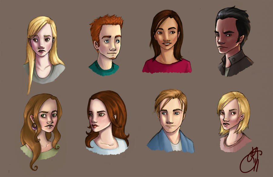
I've been redrawing my own little pets lately. Sometimes I feel like I haven't learned anything new about drawing or Photoshop and I get really frustrated. But then I look at this version ([link]) that I did less than a year ago and I can see the progress. Phew!
My main goal with this was to hit a higher level of contrast than I have in the past. I've always kind of struggled with contrast and making anything really dark so I really had to make a conscious effort doing this. It's still nothing extreme and maybe in a few months I will laugh at my feeble effort here, but for now I'm pleased with the result.
Sketch version : [link]
All these peeps and their base are belong to me.
Image size
1283x831px 443.52 KB
© 2011 - 2024 Limlight
Comments2
Join the community to add your comment. Already a deviant? Log In
I think the improvement in apparent, both in the colouring skills and the overall style! Even your use of expressions has changed - there's more variety in the new version and that's definitely a good thing.
Also, about the contrast - I think you did a pretty good work with the light/dark balance. Maybe it looks a bit dramatic in some of the faces, but then again that depends on the background. If they were to blend in a scene they would work, in my opinion. In terms of balance and shading, I think my favourite is the guy in the bottom row - the shading looks really natural without being plain and I like how he looks like he's out in the sun.
Are we going to see more of these people? They look pretty interesting!